I love typography. I've also been working on custom fonts, and this series is all about those custom font projects.
- Building Readerly
- Crafting Libron with FontForge
A while ago, I announced that I was working on Readerly, a new font derived from Newsreader. It was mostly built with an interactive build script and a bunch of manual testing on my part.
The script for Readerly in question uses Python, FontForge’s Python API and various tools to modify the font, and some knobs (weight, scaling, etc.) that decide what the final font looks like. Of course, I also made sure to integrate kobofix.py into the build script, and recently added a web font build, as well; you can download a WOFF2 version, too.
It’s a decent attempt at a tweaked font, and I was pretty happy with the result so far. But it was not a hand-made font. Since I’ve been using it as my go-to font for quite some time now, I do find some faults with it.
Improving upon Readerly
In particular, I wasn’t a fan of Newsreader’s heavy serifs. They seemed sort of… distracting, especially for body text. I looked into manually patching individual glyphs for Readerly, but before I knew it, I was effectively working on a new font with more than a handful of individual patches.
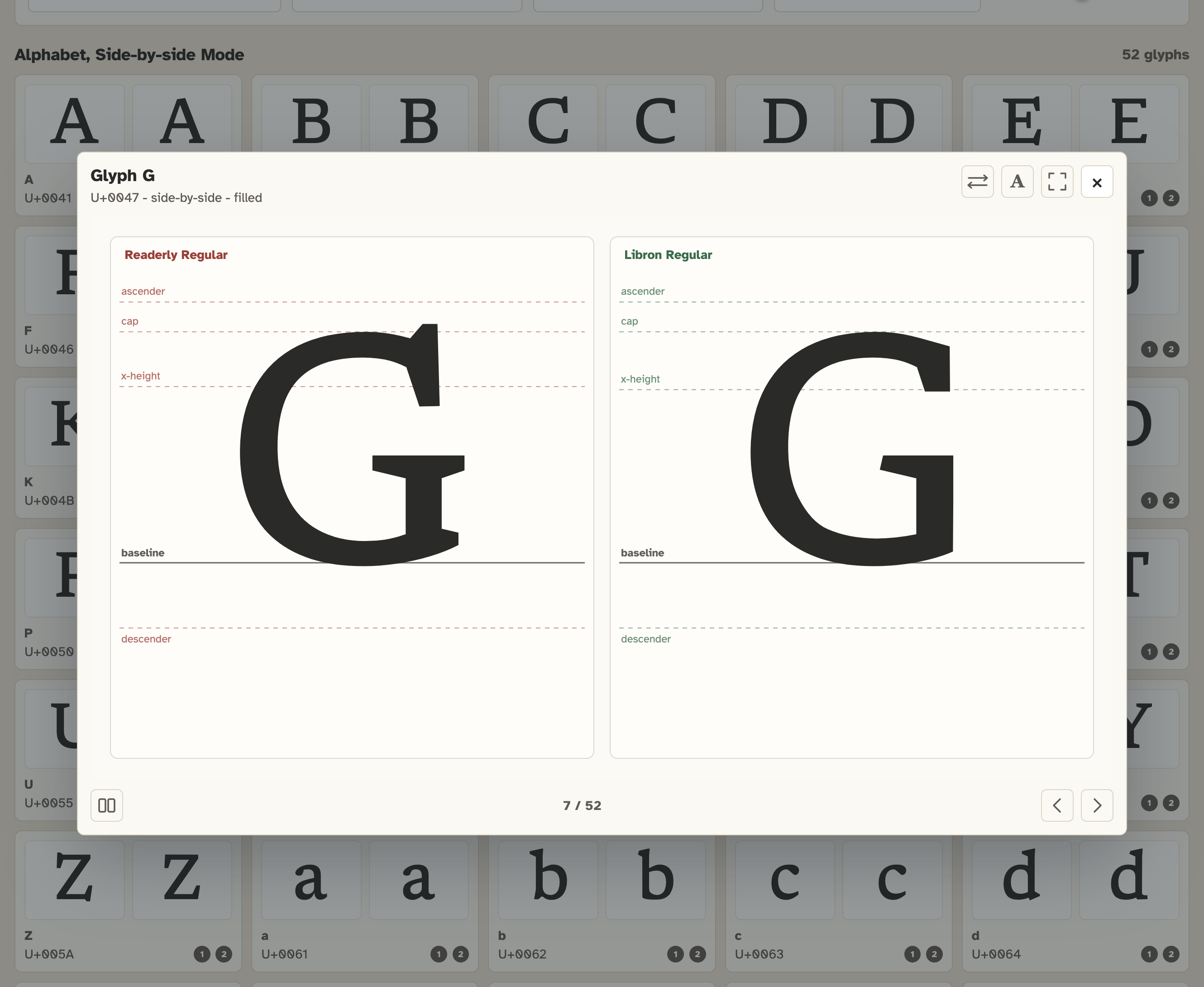
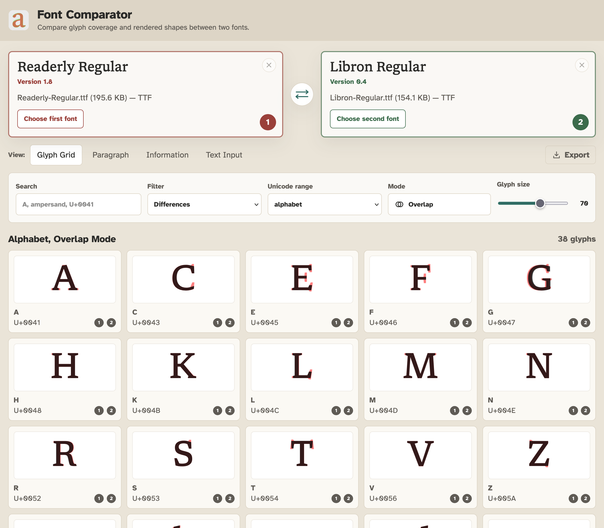
At that point I decided a fork was in order. I built a web tool that lets you compare individual glyphs between two fonts and diff them, and voila. I now had an excellent foundation to get started with some manual editing in FontForge.
I knew it’d be a time-consuming process, but probably worth it. I’ve tentatively called the resulting font Libron.
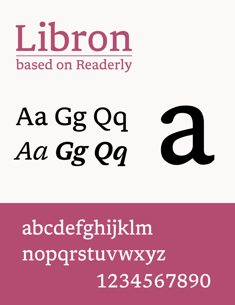
Libron addresses some of those complaints with the original Readerly. In order to make it, I started with Readerly as the basis, and I’ve been tweaking the prototype font with FontForge for the last few days, with great success.
After a lot of manual tinkering, and learning how to really use FontForge, I’ve come up with an initial version that I’m currently testing on my Kobo e-reader. So far, I think I prefer it over Readerly.
In this blog post, I’d love to take you through the journey of building it, all while imparting advice on how to use various font tooling.
Patching glyphs
My initial instinct was to simply apply individual patches to glyphs. There’s a few in the latest release of Readerly, but their nature is very limited. Only b, d, s and u were patched, specifically with fixes to address the baseline rendering.
However, I found generating patches like these to be a frustrating process. I generated the patches with the help of manual edits and getting large language models to extract the relevant diffs into a sort of patch set.
These patches would allow me to further customize Readerly, while still starting from the variable font; that’s where the configurable knobs are a definitive advantage versus manually editing glyphs, of course.
After this, I wondered: would maintaining a manual fork (a separate font) be the best way to get those edits into Readerly?
I could start from Readerly Regular as the basis, work on it, extract what I modified from that, and integrate the modified glyphs into the base font as a post-processing step.
It had not been a bad thought, but that separate font quickly grew beyond a simple fork from which I was going to extract modified glyphs to feed back into Readerly. As I saw more potential areas of improvement, the scope of the changed glyphs changed rapidly.
A separate font
Am I really going to integrate all of these changes into Readerly? To be perfectly honest, I don’t know. I may still do so in the future, perhaps under another name. I’ve named this new forked version Libron.
As far as the etymology of that word is concerned… libro, is, of course, the Spanish word for book.
I’ve got a fitting name, then, for a font that’s stylistically somewhere in the middle of Newsreader and Bookerly, no? I like to think so, at least.
How I used FontForge
FontForge has extensive documentation available that explains all of the available features. I also recommend Design with FontForge.
There are a few important tasks I needed to undertake in order to build Libron. First off, adjusting the metadata of the various fonts is required if you plan on making a new font.
This includes resetting version data, updating the copyright information, randomizing the font’s UID, and such. This is important, otherwise you risk the font showing up with the name of the original, which is not intended.
Glyph modifications
Fonts are, generally, nothing more than a series of outlines for individual character designs (“glyphs”) that are, effectively, vector based; these can be mathematically expressed and scaled.
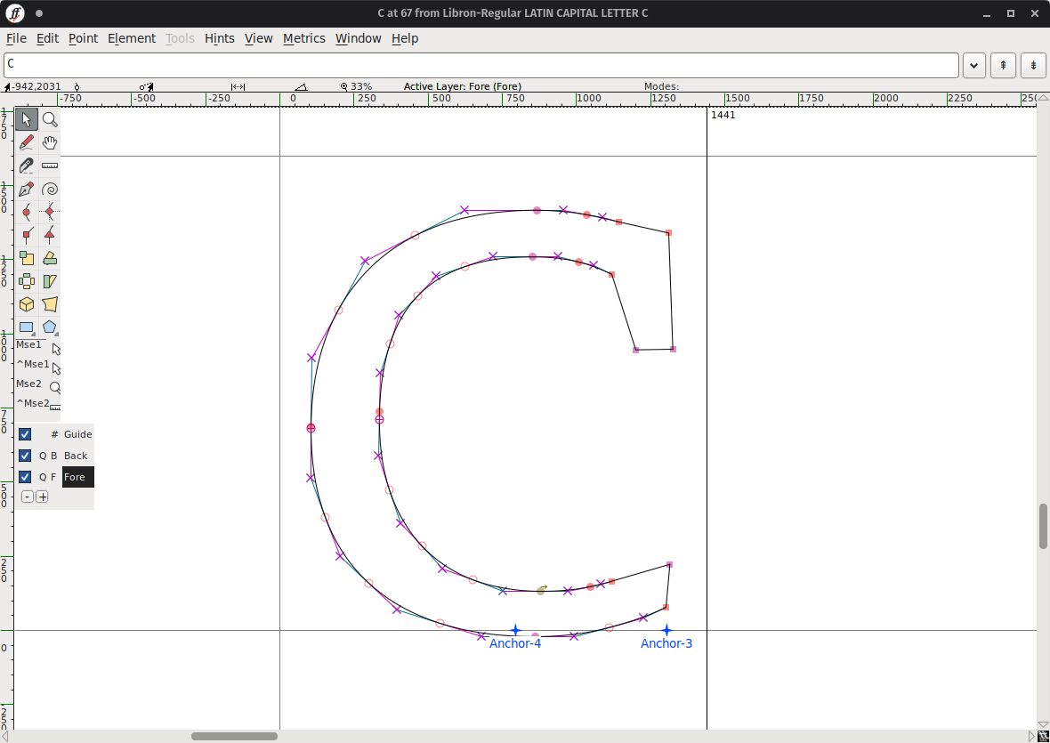
I knew that I was going to make modifications to the uppercase characters, so I needed to adjust the vector outlines here of, for example, the uppercase C. You can see what the new outline looks like here:
Bearings and kern pairs
In addition to editing glyphs, another aspect of making a good font has to do with the left and right bearings for individual glyphs. Bearings dictate how much room is left between individual glyphs, and dictates how tightly spaced the individual letters are.
Getting these metrics right is very important. This isn’t necessarily something you can easily automate. It takes trial and error to determine what works best optically for the design of your particular font.
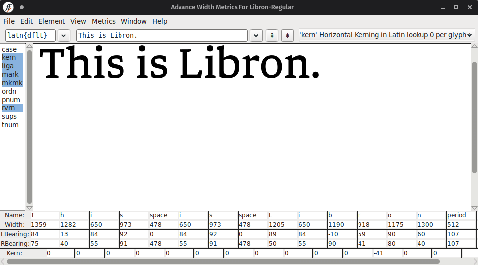
In addition to broad adjustments in terms of metrics, you can also tweak individual glyph combinations with kerning, which is an additional modifier that is applied in addition to the default tracking.
Because it would be silly to manage all of these individual kern pairs, there’s also something called kern classes, which allows you to group similar glyphs together so you can apply consistent kerning to a group of characters.
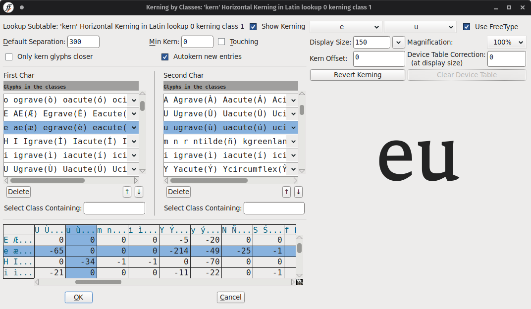
For the most part, I’ve inherited existing kern pairs from Newsreader and Readerly, but in the future some changes may be required due to the nature of the outline changes to the font. Some glyphs are now more narrow, which has an optical impact and requires changes to tracking and kerning.
Build script
That’s all I do with FontForge. I make sure the font is mostly ready for immediate use. The FontForge files are the “source” files that are then processed and exported. I say processed, because I have a build script, like with Readerly.
This build script then uses a custom container image called fntbld-oci which I built specifically to have access to an easy build system that has Python, common Python packages for font checks, validation and FontForge’s CLI, and uses all of these bits to generate the release, which includes the regular and web fonts.
Download
You can find Libron on GitHub. It’s still a work in progress, so it will likely be updated frequently over the next few weeks. Once I’m happy enough with the font, I will tag that as version 1.0 of the font.
If you would like to download Libron so you can use it on your e-reader, you have a few options. You can:
- Download the latest release for Kobo devices directly.
- Download the latest release for other e-readers directly.
Currently, Libron is not yet included in my eBook Fonts repository. It will be added at a later date, once version 1.0 is ready.
Acknowledgements
Like last time, I would like to acknowledge the original type designers from Production Type who worked on Newsreader and created a very beautiful font.
I would also like to reference my previous work on Readerly, as well, since it formed the basis for this particular modification.
Update
October 5, 2026
I also made a promotional video that got quite popular on YouTube. It may be the one that brought you here? Either way, if you haven’t seen it, check it out below.
This was not generated: Unless explicitly specified, the posts on my blog are my own creative work. 100% written (typos included) and edited by me; not generated using e.g. large language models.