This post is part of a collection of posts related to electronic reading.
- Patching Fonts for my Kobo
- Tweaking EB Garamond
- Electronic Reading Adventures
I have not been spending much time on the computer, lately. This is mostly due to the rest required that is part of dealing with my burn-out. I’ve been working on getting the basics under control. I’ve also been reading a bunch: it’s one of the few activities I can spend more time on without mental exhaustion kicking in quickly.1
For reading fantasy books I settled on reading those with EB Garamond, but I wasn’t entirely happy with that font. Nonetheless, it was good enough. After scouring the net, I stumbled upon EB Garamond Absinthe. Notably, it contains larger glyphs and better line spacing, which are both welcome changes.
I started using this version, but I noticed some ligatures weren’t rendering nicely on my Kobo. So, what’s a man to do? Tweak the font myself, of course.2
How did we get here?
After patching pre-existing fonts, I decided that the next step of my e-reading journey would be tweaking an existing font to my heart’s desire in FontForge. After all, Kobo devices are a bit lacking when it comes to the fonts that ship with the newer devices. I did recently get that Kobo Libra Color over the summer, after all.
💁🏻♂️ The new Kobo Libra Color and Kobo Clara Color devices now ship without the quality fonts that shipped on older models. Fonts like Amasis, Avenir Next, Caecilia and Malabar are no longer included. This is likely due to an expired or non-renewed licensing deal. New devices ship with a new selection of fonts. If you want to add quality fonts to your Kobo, I have made a selection of OFL-licensed fonts, including the font discussed in this post, which are now available for download.
I definitely wanted to have a quality Garamond font on my e-reader. It makes a lot of sense to include it: after all, Adobe Garamond Pro is often used for printed books.
Unfortunately, while I own a copy (from back in the Adobe CS6 days) customizing the individual font files isn’t allowed by the license I agreed to.
However, I am allowed to modify a font distributed under the Open Font License, like EB Garamond. So… today I wrote about tweaking EB Garamond into my own variant, which I’ve dubbed “NV Garamond”.
What was wrong with EB Garamond?
Nothing, per se. It just didn’t render optimally on my Kobo device. Here’s what I noticed, compared to other fonts on the Kobo:
- I noticed that the general glyph size was off: the characters appeared much smaller relative to other fonts.
- The line spacing was rather large with the slider set to a minimum. For a maximum level of control, I prefer my line spacing to be minimal.
If you’re using EB Garamond this way in a text editor or word processor, these items don’t need to be an issue. You have granular control over how text is rendered. On the Kobo, though, that control is minimal.
So, I decided I was going to need to tweak the font, and produce something similar to EB Garamond Absinthe. I downloaded the OTF fonts from this repository and started my work.
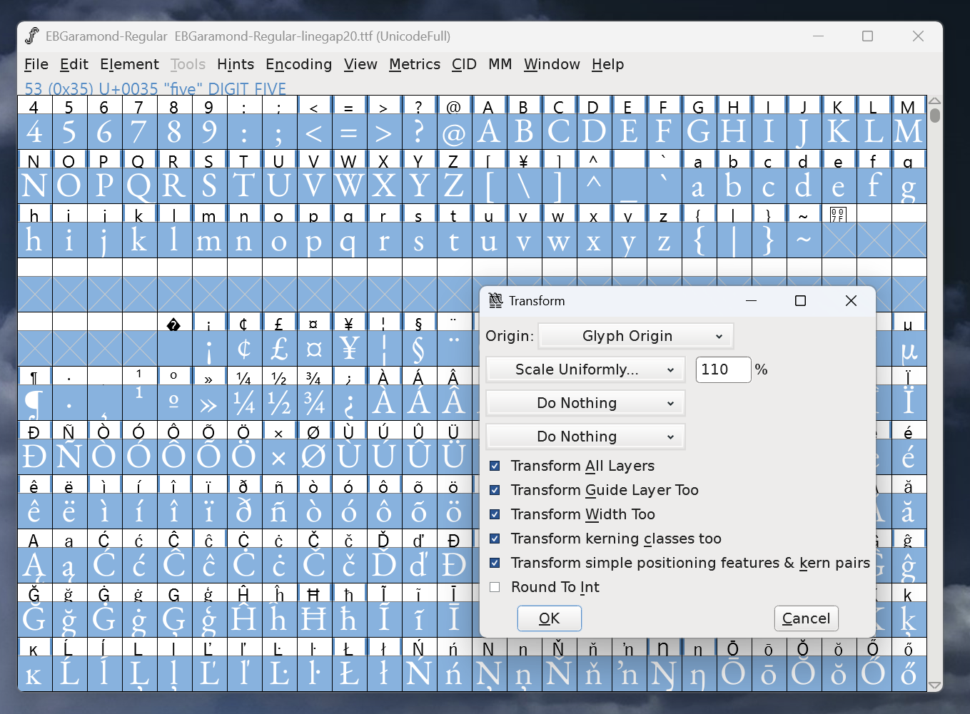
Scaling glyphs
The first step required was to ensure that the font appears slightly larger. To do this, I needed to apply a general scaling to all glyphs. I discovered a helpful guide, which also included steps on how to verify that you’ve scaled the font correctly.

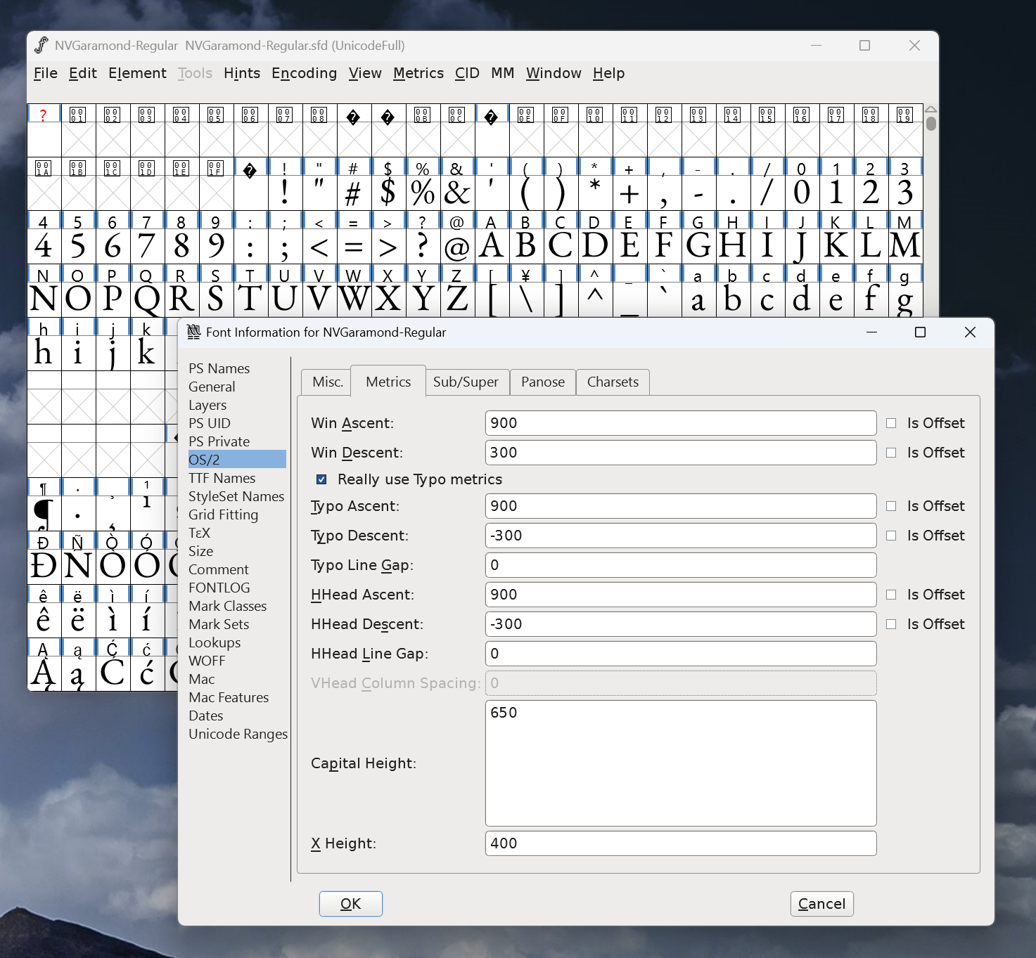
Understanding and modifying metrics
The next step was to modify the line spacing. Here’s how I understood that works: a font has an ‘Em Size’ defined. This value is a sum of the ascent and descent of the font. Need to understand what these words mean? Read more here.
After setting the base Em Size and taking ascent and descent values into account, you can customize the different ascent and descent values for Win/Typo/HHead.

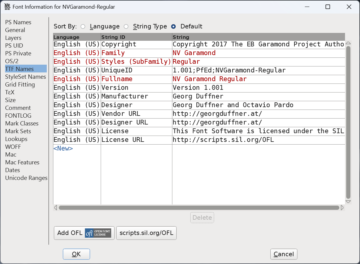
Renaming the font
Finally, I wanted to change the font’s name and export it so I could install it side-by-side with EB Garamond.
This was a matter of adjusting the unique identifier of the font and changing the PostScript names, as well as adjusting the values in the TTF Names section in FontForge.

I made sure to retain the original copyright information, as this is an OFL licensed font, after all. I’ve only adjusted the font name and added a remark about having resized the glyphs.
Where can I get it?
You can download the latest release on GitHub.
The more stimuli I am confronted with directly, the more quickly I tire. Programming, at this time, is simply not something I can do for more than 30 minutes before I need to actually physically rest. I will eventually break down what the last few weeks have been like, but the truth is… it hasn’t been great. ↩
You could call me quite the typography nerd. Always have been. It was one of the main reasons I wanted a Mac in the early 2010’s. I nerd out when Microsoft or Apple ships some new fonts with their software suites… and I have been looking for the perfect serif font for my own reading purposes for quite some time now. Which brings us back to this post, I suppose. ↩