This post is part of a collection of posts related to electronic reading.
- Patching Fonts for my Kobo
- Tweaking EB Garamond
- Electronic Reading Adventures
- Down the Kobo Font Kerning Rabbit Hole
Table of Contents
👋 Love reading on your e-reader and want to download these patched fonts? If you want some more fonts for your Kobo or Kindle, you can skip to a dedicated page where you can download the fonts. Otherwise, keep reading about why I experimented with these fonts.
Recently, I’ve been reading more again. In particular, I’ve started my journey throughout the Cosmere, which consists of a whole series of books by Brandon Sanderson. I just got around to finishing Warbreaker after reading Elantris, and I just started on the first Mistborn book, The Final Empire.
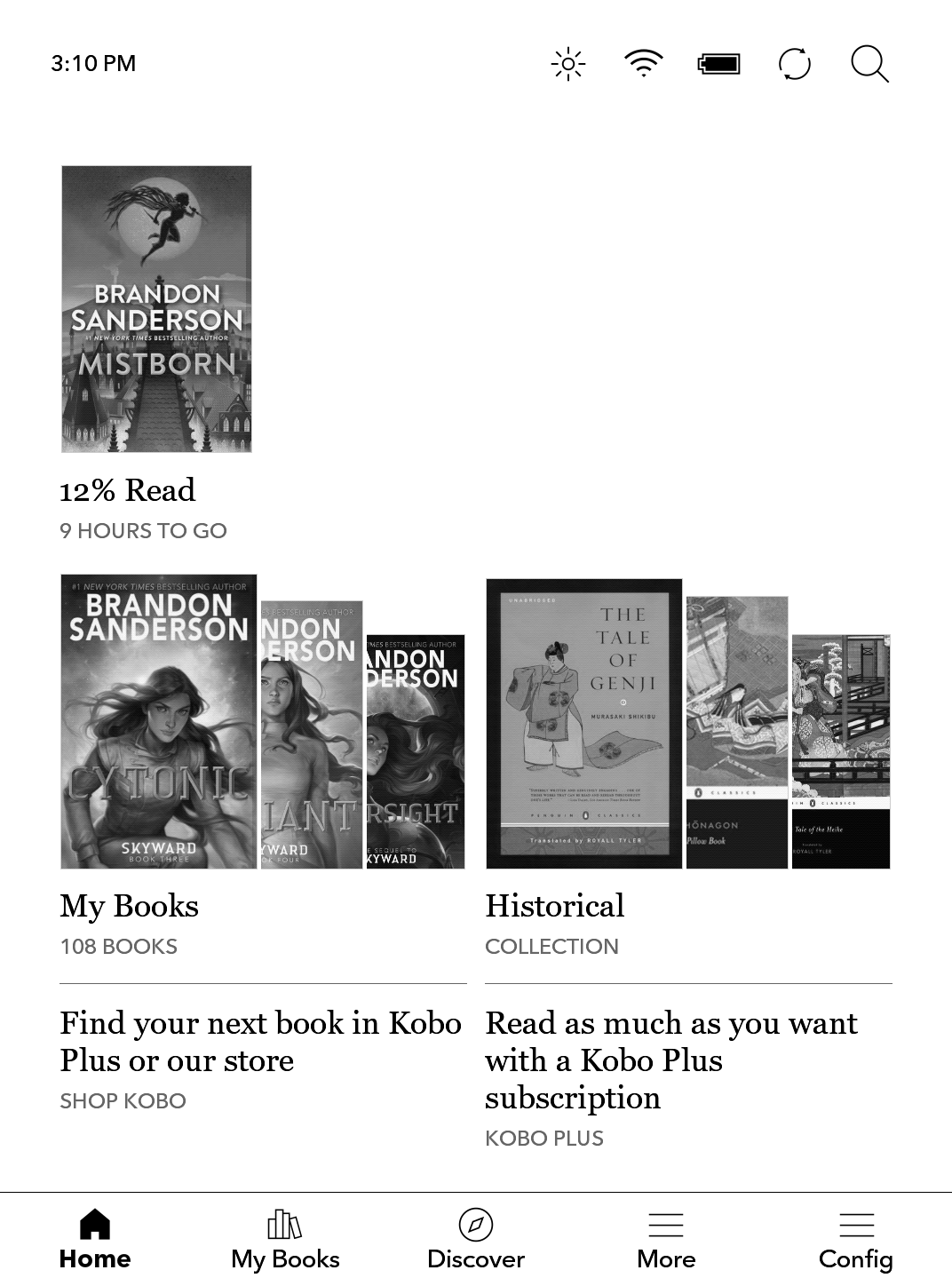
I’ve always been a bit of a typography nerd, and I’ve been really appreciating the precise control you have over the default typography on Kobo devices, like the Kobo Libra 2 (which is the one I currently have).
But because I’m such a typography nerd, I wanted the optimal font with an optimal font rendering on my Kobo. This was a fun experience, and it allowed me to search for more great, freely available serif fonts.
What I Discovered
After some brief searching, I stumbled upon the often recommended ChareInk which is really just a modified version of Charis SIL, which itself is based on Bitstream Charter. It looks like this:
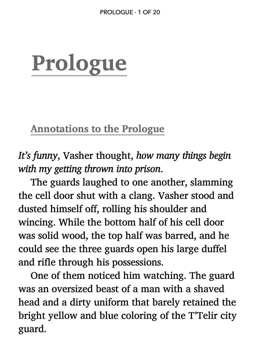
While the original Charter is not available under an Open Font License, you can get it here. It’s got less glyph coverage than Charis, so you may notice that some characters won’t render correctly.
This has been my preferred font for some time now. But I also wanted some alternatives. As I started exploring various other custom fonts, I found myself bumping into a few common issues.
Common Issues
Here’s what I encountered:
- In certain situations, the Kobo would, for no clear discernable reason, use the Bold version instead of the Regular font. I had to investigate why this was the case, and deal with it.
- Depending on how the fonts were authored, the base “line height” (with Kobo’s reader setting at the minimum) is far too big. That means that unfortunately, the font is only usable if I want a line spacing that looks more like 150%. This has to do with the font metrics in regard to X-height, ascender, descender and baseline.
So, I decided to take a few fonts that are properly licensed for modification (all of these are available under the OFL) to be allowed, and made my own customized versions that did not suffer from these two issues.
The Fonts I Chose
I decided on a couple of fonts that were licensed in such a way I could easily distribute them. Among them, you will find Charis SIL, Ibarra Real Nova, Gelasio, Yrsa, Newsreader, Literata.
I’ve also included copies of XCharter, ChareInk 5, Andika and EB Garamond.
If you’d like to download this altered versions, you can do so here on GitHub.
How I Made These
In order to fix the issues I listed above, I needed to investigate what was going wrong and why, first. I discovered I needed to apply a bunch of different fixes for a bunch of different reasons.
You may have your own set of fonts and want to also apply these changes. I’ve documented the steps below.
1. Fixing Line Height
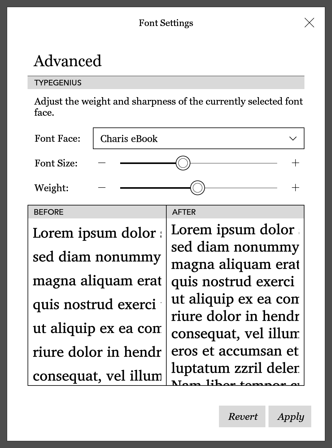
In order to fix the line height issue, I ended up using the font-line tool’s vertical line modification, like so:
$ font-line percent 20 ./fonts/Charis*.ttf
On Windows, using Terminal and PowerShell, you may need to do something like this:
> font-line percent 20 @(get-childitem -name *.ttf)
To illustrate this improvement, this is the font at its default line height before, as Charis SIL (left) and after, as Charis eBook (right).
2. Renaming Fonts
For this, I used the fontname.py script, which quickly allowed me to rename the fonts. This allows those altered fonts to exist side-by-side on my system with the original fonts.
On Windows, using Terminal and PowerShell, you can do something like this:
> python fontname.py "Charis eBook" @(get-childitem -name *.ttf)
After altering the font’s line height, I then took those modified fonts and renamed them. I then copied them to my Kobo.
Aside: Adjusting Font Weight
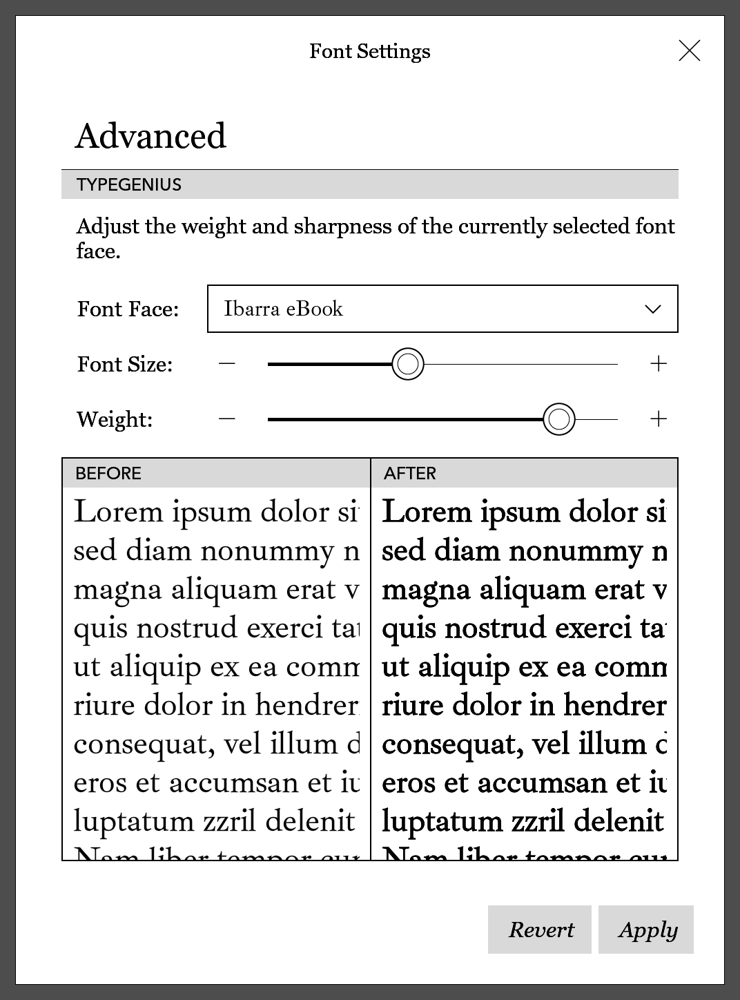
Fortunately, with the line height adjusted and font metadata set correctly, you can adjust the precise font weight on the Kobo itself. In the Advanced menu you can drag the slider as far as you want.
For a font like Ibarra eBook, you may want to bump the weight slider a bit if that’s your preference. (For maximum readability, I prefer to bump this setting a little.)
3. Fixing PANOSE Font Information
When I downloaded Yrsa from Google Web Fonts, I picked the static font files and found that Kobo was rendering this font using the bold variant all the time.
I didn’t understand why this was the case, but using FontForge I was able to learn about PANOSE values. In short, this is additional metadata that identifies a font’s specific style: weight, proportion, style… if it is set incorrectly then the Kobo book viewer might have issues.
In addition to specifying font weights in various places, you also need to declare the weight as a PANOSE value. If the value is 5, that is the “book” weight, if it is 8, it is the “bold” weight.
My suspicion was that this Ysra-Bold.ttf file contained incorrect metadata.
I told Copilot to generate me a Python script that would let me extract the relevant weight information, and this way I could verify if my theory was correct. After some prodding, this is what I was able to use:
import sys
from fontTools.ttLib import TTFont

def get_panose_values(font_path):
    try:
        font = TTFont(font_path)
        os2_table = font['OS/2']
        panose = os2_table.panose
        return panose
    except Exception as e:
        return f"Error: {str(e)}"

def format_panose_values(panose):
    return "\n".join(f"{key}: {getattr(panose, key)}" for key in dir(panose) if not key.startswith("_"))

if __name__ == "__main__":
    if len(sys.argv) != 2:
        print("Usage: python read_panose.py <font_path>")
        sys.exit(1)

    font_path = sys.argv[1]
    panose_values = get_panose_values(font_path)
    formatted_values = format_panose_values(panose_values)
    print(f"PANOSE values for font {font_path}:\n{formatted_values}")
I then let loose the script on the suspected font file, like so:
$ python3 ./read_panose.py ./Yrsa-Bold.ttf

PANOSE values for font ./Yrsa-Bold.ttf:
bArmStyle: 0
bContrast: 6
bFamilyType: 2
bLetterForm: 0
bMidline: 0
bProportion: 3
bSerifStyle: 2
bStrokeVariation: 4
bWeight: 5
bXHeight: 0
Sure enough, the weight value corresponds to 5, which meant that my Kobo now knew two font files belonging to the same family that both claim to be the regular weight version.
Ultimately, the bold font file was incorrectly being preferred over the regular variant, probably because it loaded in earlier alphabetically. (Bold comes before Regular as a suffix, perhaps?) Oops. So, this was probably the cause.
I did some more searching, found the Ysra repository on GitHub, downloaded the latest version of the generated font.
Promisingly, the release message noted:
Minor updates to the font meta data and build process affecting transformed components.
So, I tried my check again.
$ python3 ./read_panose.py ./Yrsa-Bold.ttf

PANOSE values for font ./Yrsa-Bold.ttf:
bArmStyle: 0
bContrast: 6
bFamilyType: 2
bLetterForm: 0
bMidline: 0
bProportion: 3
bSerifStyle: 2
bStrokeVariation: 4
bWeight: 8
bXHeight: 0
After getting the fonts with the correct PANOSE data, I was able to reapply my changes to the font and after rebooting my Kobo all was well. No more bold font was now being used to render regular text!
Important: You really need to reboot your Kobo for the software to parse the new PANOSE data if you patched the font and had it installed before.1
I didn’t need to in this case, but if you need to manually modify these files, you may want to use panosifier which can be found on GitHub. This utility allows you to modify these values easily, as well.
For example, to fix this:
$ panosifier --weight 8 ./Yrsa-Bold.ttf
./Yrsa-Bold.ttf panose:
   FamilyType: 2
   SerifStyle: 2
   Weight: 8
   Proportion: 3
   Contrast: 6
   StrokeVariation: 4
   ArmStyle: 0
   LetterForm: 0
   Midline: 0
   XHeight: 0
I eventually ended up using panosifier to fix my own copy of Bookerly which contained incorrect PANOSE data.
(I got my copy from the Amazon Developer website I have linked above, but I won’t distribute the “fixed” font myself, as it’s not licensed under the OFL.)
The Curious Case of the Charter Variants
If you want to use a font based on Charter, you have a couple of options. I actually really like the original font, but which version can you legally download for free? Well, a couple, actually. Here’s the different ones:
Charter
If you want the original font, you can’t go wrong with the original Bitstream Charter. For more glyph coverage, you may want to check out XCharter.2
If you are willing to pay for the best version of this font, you can always purchase a copy of Charter BT Pro. But that’s probably overkill, given the existence of XCharter.
Charis SIL
If you want the best possible glyph coverage and character set support for free, Charis SIL is an excellent alternative to XCharter. Charis eBook is my customized version which is simply a renamed Charis SIL Compact.
ChareInk
Finally, you may want to consider the very popular ChareInk. The latest version available on the MobileRead forums is based on Charis SIL version 6, which I’ve found has worse italics on my Kobo.
I did also have a copy of the older ChareInk archived, so I’ve renamed it and made it available as ChareInk 5. You may need to rename the font family for it to work correctly on your Kobo as I’ve noticed that fonts that end with a number don’t seem to load correctly sometimes. (I don’t use ChareInk currently.)
Conclusion & Downloads
Customized Fonts
I’ve made my customized fonts available on GitHub. For myself, but also for others who may find their reading experience improved this way.
If you had copied these original fonts from, for example, Google Fonts, you would end up with the issues I described earlier.
Incorrect metadata has been fixed, and some font families have been renamed. And with a line spacing of 20%, you have a lot of flexibility with the sliders on your Kobo, as you can see on the screenshot below.
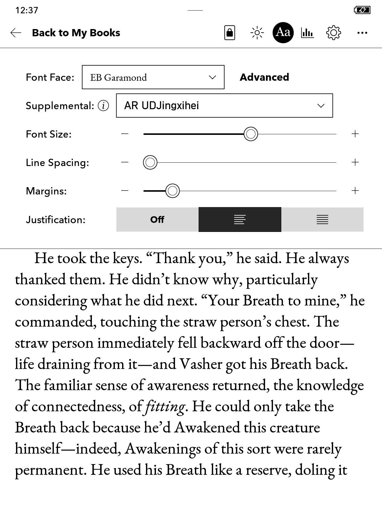
To install these fonts on your own Kobo device, unzip the .zip files and drag the font files into the fonts directory at the root of your Kobo device after connecting your Kobo to your PC via USB cable. You may need to create the fonts directory.
All these fonts are available under their original OFL license unless specified differently.
NickelMenu Config
I’ve also shared my NickelMenu setup as well. You can learn more about modding your Kobo and installing NickelMenu on the official website.
I hope that you find the fonts and configuration file useful. I wholeheartedly encourage everyone to try out an e-reader, as it certainly reignited my desire to read more.
I do recommend sticking with a “pure” e-reader, so you don’t get distracted by whatever else your device is capable of. (Recently there’s been more tablets with eInk displays.)
Someone mailed me about this post and it turned out that rebooting helped after they had patched the font, so I figured I’d add this addendum. ↩
After some experimentation and reading I’ve found that I prefer XCharter over all the alternatives. At least, I do on Kobo. The slightly bolder ChareInk may be more preferable on Kindle. ↩