This post is part of a collection of posts related to electronic reading.
- Patching Fonts for my Kobo
- Tweaking EB Garamond
- Electronic Reading Adventures
- Down the Kobo Font Kerning Rabbit Hole
Not too long ago, I released version 2.0 of my collection of tweaked fonts, and I was pretty sure I was done tweaking fonts for the rest of the year.
However, this morning I received a message in my inbox from a friendly person who linked me to an interesting post on the MobileRead forums and noted:
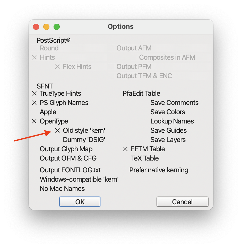
One suggestion would be to consider adding ‘old-style’ kern tables so that kerning works correctly when reading
kepubfiles: see e.g. https://www.mobileread.com/forums/showthread.php?t=259102
Okay, that’s cool. Kerning is notoriously bad on Kobo’s kepub renderer, so perhaps it was possible to re-export my fonts and improve them even further?
The email continued:
I’ve had some luck in the past with getting fonts to kern correctly on Kobo by just using Fontforge and exporting them with old-style kerning tables enables.
So, I gave it a try and exported my go-to option, Charter.
Take a look at the results below, I’ve made an interactive component that toggles between both states:
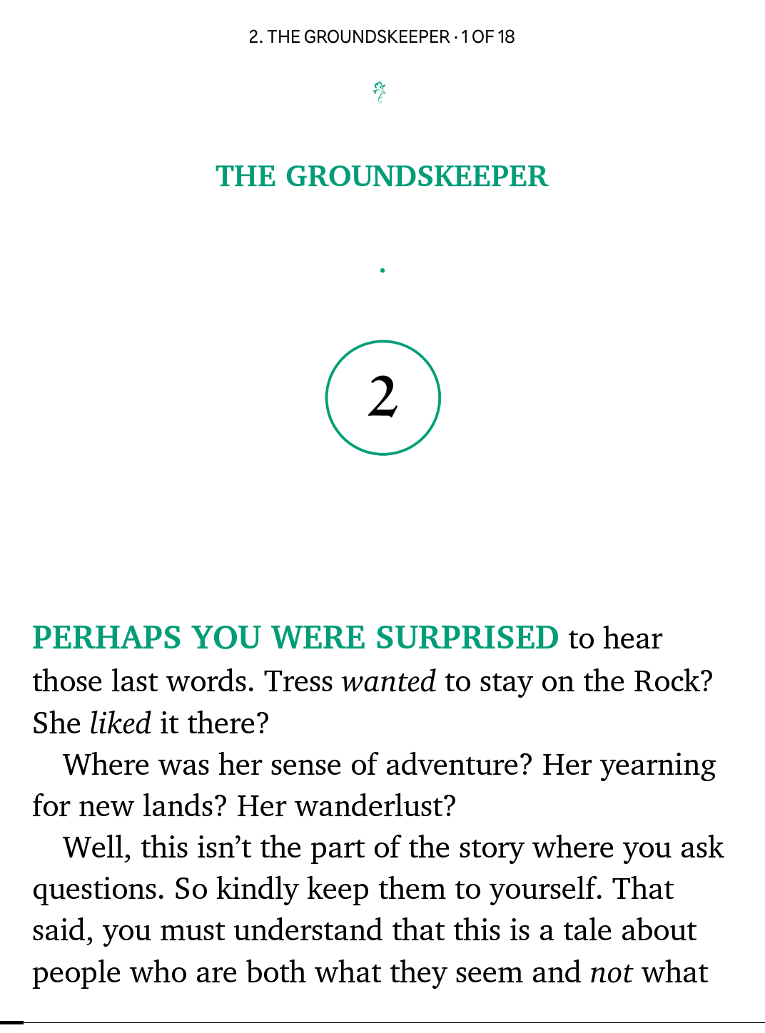
Bad: Font exported without old-style kerning.
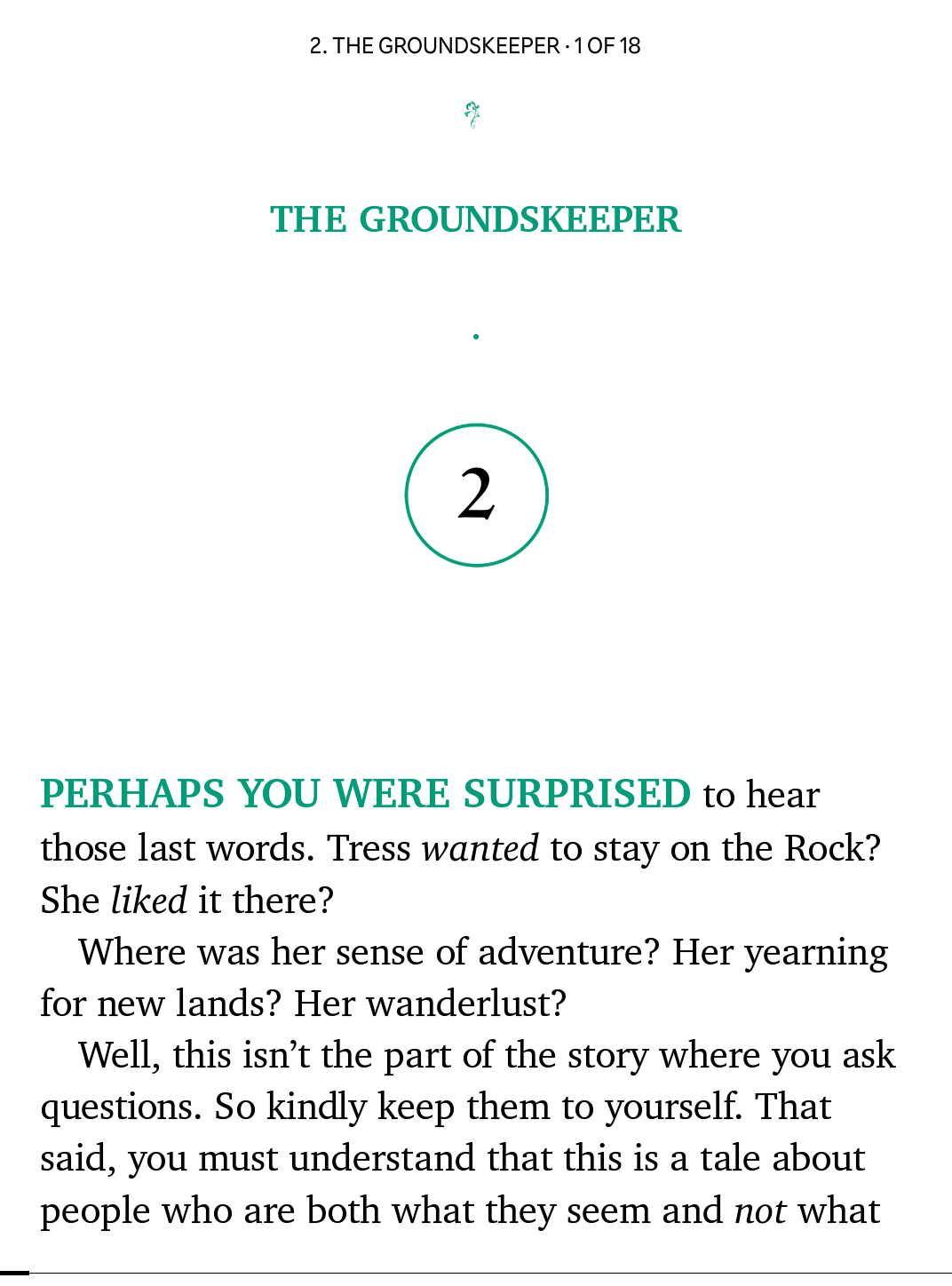
Good: Font exported with old-style kerning.
It’s obvious that KC Charter actually seems to render correctly. That’s great! I tried this approach with a few others fonts, and sure enough, things seem to be better this way.
If you’ve taken a look at the repository, you may have noticed that I’ve chosen to keep these fonts as distinct ones from the regular collection. This is done for two reasons:
- I want it to be obvious which fonts use Kobo-compatible old-style kerning.
- When using old-style kerning, fonts may not render correctly on other operating systems.
In particular, FontForge warns you about Windows when exporting only with old-style kerning.
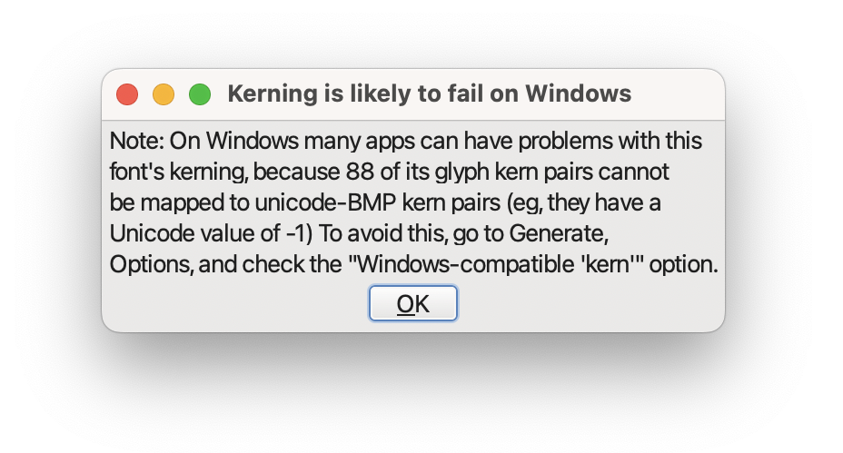
There is another toggle you can use (Windows-compatible ‘kern’), but for some fonts this causes issues when exporting due to limitations in the kerning table.
As it turns out, there’s a maximum size that is reached and certain kerning info may be missing beyond a particular point.
If you want to have the best reading experience with your kepub books, using the Kobo-compatible fonts is now the way to go.
I’ll be updating the repository soon with the Kobo Collection, but you can try out a preview already.