Table of Contents
💁🏻♂️ If you are looking to read more on my impressions of the Kobo Libra Color or Kindle Colorsoft, both of which sport Kaleido screens, you may want to skip to the Examining Kaleido 3 section. For a more direct comparison, check out my Interactive Component to compare screens below.
Ever since I got my first Kobo e-reader, I have been keeping up-to-date with the latest e-ink devices and technologies. In fact, a totally embarrassing fact is that I probably have spent far too much money on various Kobo devices and too little time reading on them.
Oh well, it’s something I’m trying to rectify. I happen to have plenty of Brandon Sanderson books to read, as well as a selection of Warhammer books I previously bought from Black Library. I also still need to finish The Hitchhiker’s Guide to the Galaxy omnibus, the first e-book I purchased, and, regrettably, never finished.
As a technology nerd, I have been really enjoying using my Kobo Libra 2: it is easily my favorite Kobo device to date. Previously, I’ve had a few older models, too, all of which I’ve been able to give new owners. I was wondering what would be next, as there were rumblings about Rakuten releasing new color e-ink devices, and that sounded cool.
Interactive Component
Interactive: A macro shot of a Kobo Libra Color using a Kaleido screen.
Click or tap to toggle to the other type of screen.
Interactive: A macro shot of a Kobo Libra 2 using a Carta screen.
Click or tap to toggle to the other type of screen.
PocketBook InkPad
After doing some initial research, I stumbled upon PocketBook. I looked at the various devices on offer and eventually purchased a PocketBook InkPad Color 3, which sports a dual-layer approach to coloring in the form of the so-called Kaleido screen. It was this review that convinced me to pull the trigger.
I have a few digital comics, various programming books and a few ebooks that I always had to sideload onto my Kobo. All of these are more fun to read on the PocketBook. I also love that you can set up KOReader as first-class reader on the PocketBook device, unlike on Kobo where you are reliant on the NickelMenu mod.
The PocketBook devices are easy to customize, and armed with KOReader reading on this device is an actual delight. The built-in reader is pretty mediocre with only few customization options, unfortunately. The OS is very tweakable, though, and doesn’t send all of your data to the cloud. Good news for us privacy conscious folk!
I’m not sure if I’ll be keeping the PocketBook, given the new Kobo lineup is a more close match to what I’m looking for in a device, but it has provided me a good early glance at what to expect from these new screens.
Frankly, it’s a bit of a mixed bag, to be honest: the screens are darker and there’s an apparent grain due to the way these screens work.
Examining Kaleido 3
A couple of days ago, Kobo revealed their new Kobo Clara Color and Kobo Libra Color devices, which are going to be using the same Kaleido technology. To be fair: this is awesome technology.
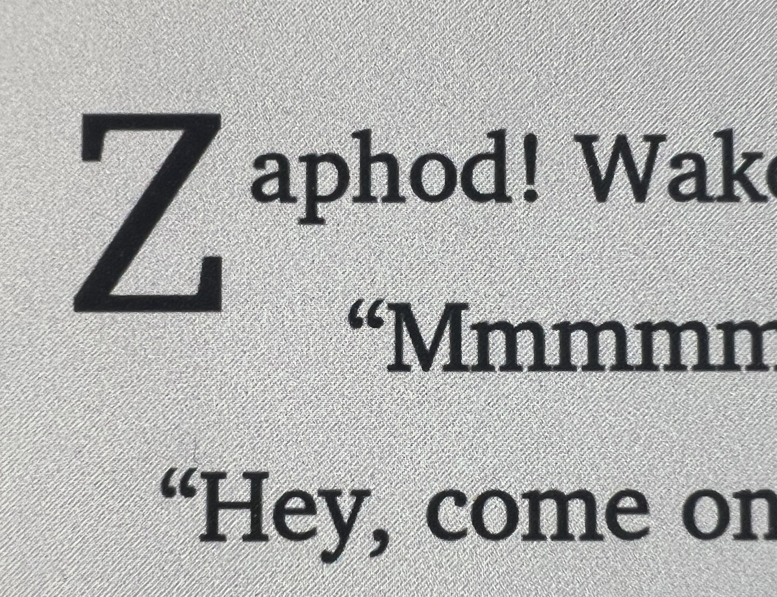
These screens are significantly darker compared to their older Carta siblings. Here’s a macro shot of my PocketBook’s similar screen that shows the persistent RGB layer which can be found below the “ink” layer:
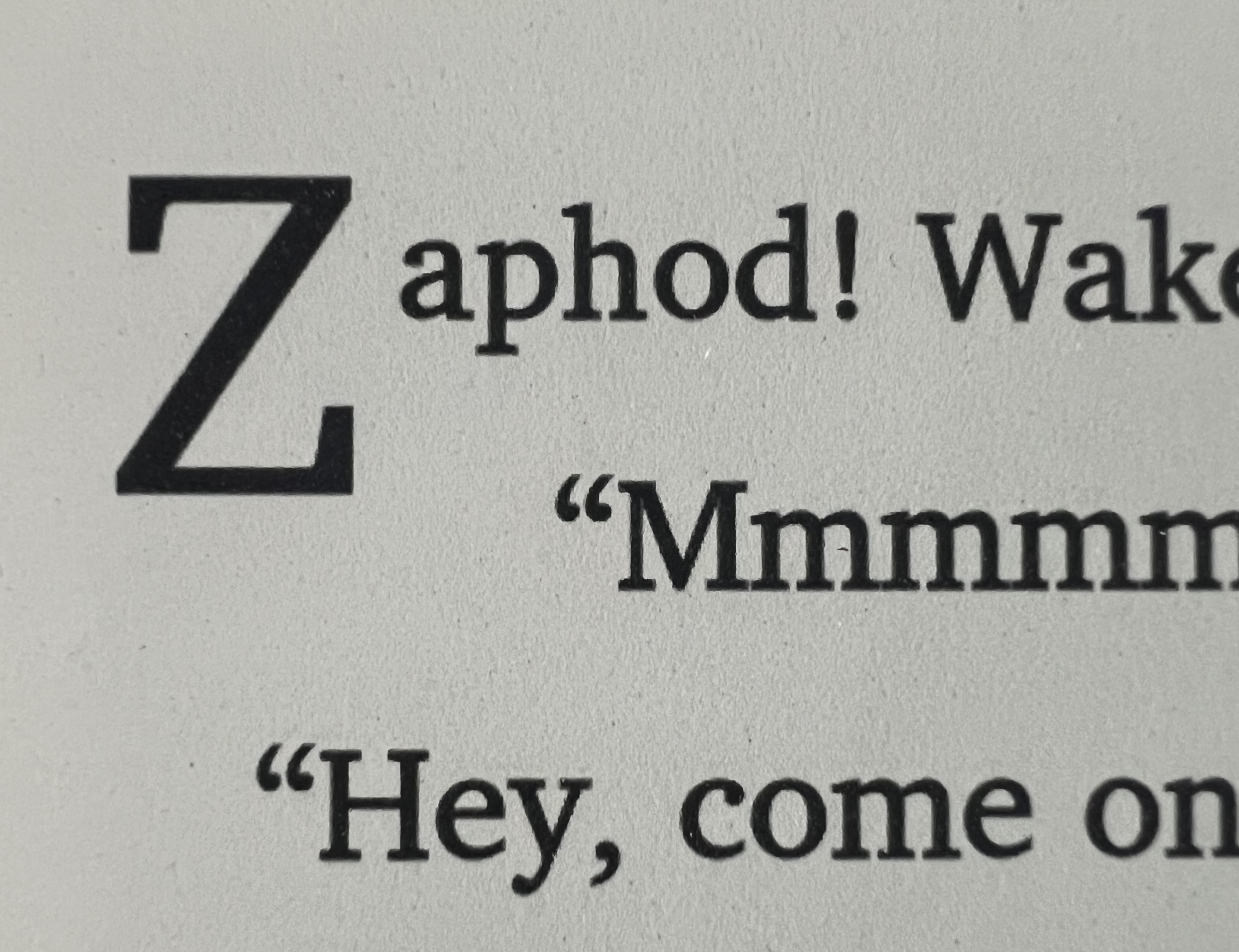
It’s subtle from afar, but when it comes to text-only books I strictly prefer the Carta screens, if only because they are lighter and don’t have this “grainy” look which is caused by the color layer. For comparison, this is macro shot of the Carta screen, the surface of which definitely looks a little bit more like paper:
I suspect that the new Kobo color devices will look the same, which is definitely going to be a little bit of a disappointment for me. The colors using this display technology certainly look okay, but they are still quite pastel-like, and the trade-off is worse text rendering for normal books.
I’m certainly going to be hanging on to my Libra 2, that’s for sure, as I personally find the Carta display a bit easier to read on. (I ended getting a Libra Color regardless, see the addendum below. I am keeping the Libra 2 around as well.)
Curiously, Kobo does offer a cheaper black and white variant of their smaller device, a Kobo Clara BW. This will be available alongside the Kobo Clara Color variant, which I think is a good move.
I hope they consider a similar Libra model with a Carta display in the future, with equivalent hardware upgrades internally. The new Libra Color seems to have received more memory and a faster processor, too. A welcome upgrade.
Addendum #1: Kobo Libra Color
This addendum was added in early August of 2024, after I have returned my PocketBook InkPad Color, and replaced it with a Kobo Libra Color. Read more about my PocketBook InkPad Color impressions below.
I can confirm that, after purchasing a Kobo Libra Color, that the new display technology is identical as it was on the PocketBook. I ended up returning the latter in favour of the Libra Color, and have not regretted it.
I also bought a Clara BW, and it is significantly faster than the Clara 2E, which I have been able to try out for a little bit in a store before. All devices in Kobo’s new lineup do appear to be significantly faster.
Addendum #2: Kindle Colorsoft
This addendum was added in November of 2024, after the release of the Kindle Colorsoft. Amazon still sells a black-and-white Kindle Paperwhite.
Amazon has also released their latest e-reader with color: Kindle Colorsoft.
The exact same examination applies to the new Kindle line-up: the Kaleido display on the Colorsoft comes with the same trade-offs as the Kobo Libra Color. It will look darker and will require a higher backlight setting in order to achieve the same brightness as you may be used to on a Kindle Paperwhite.
For this reason, you may want to check a Kindle Paperwhite instead if you dislike the “background grain” that comes with this display technology.